Showing posts with label How To. Show all posts

07 September, 2019

TEACH YOURSELF | How To Add Feeling Through Composition

Artistic know-how does not need to be expensive or attained at a school like CalArts. That's why I research free online advice on drawing and encourage my readers to do the same. You can take your education into your own hands.

For this post, I explore the relationship between composition and feeling -- which is, of course, essential to understand for filmmakers. Conveying emotions through visuals is part of what makes filmmaking so exciting and creative!

My hope is that these handouts and videos, which I share below, can inspire students to learn the fundamentals of composition and feeling -- without paying a fortune!

Lines represent feelings

Here is a handout that was shared by Mark Kennedy on his blog Temple of the Seven Golden Camels. These illustrations, originally from the book Creative Illustration, show how different shapes connote different feelings. For instance, horizontals and verticals are calm, whereas diagonals are full of motion and tension.


(Source: sevencamels)


So depending on the mood of the piece you are working on, different lines and how they divide the canvas will aid in conveying that feeling you’re going for.


Brad Bird did a handout on how to add depth to your storyboards/compositions.

Pace and staging characters 

Here is also a video that analyzes the pacing of the camera moves in Brad Bird's movies and how such adds to the story of each film, respectively. Toward the end, there is a brief mentioning of symmetric vs. dynamic filmmaking.


As this video highlights, how you make cuts and stage your characters has a great effect on the ‘feel’ of the movie.

Tony Zhou has made a similar video that explains why Edgar Wright’s filmmaking works so well – namely, because he takes advantage of the film medium and shows visuals that are funny, even without dialogue.


I recommend taking a look at some (or all) of the videos Zhou has posted!


Characters and how they fit into the overall composition likewise connotes a lot about the feeling of a scene. For instance, a character can be visually depicted as taking up a large portion of a shot and we will sense that she or he is more important or powerful than any other given character.

This video, by Zachery Ramos-Tayolor, gives an example from the movie Steve Jobs. It highlights how the characters’ movement indicates who is in power.


Similarly, Mark Kennedy did a blog post that analyzes the movements of characters and how such symbolize the power dynamics within a scene in Paths of Glory.


(Source: sevencamels)


The camera angle can also aid in power dynamics. When I was studying How to Train Your Dragon, I noticed that in scenes when Stoick was imposing, the camera angle was always placed up toward him and down toward Hiccup. This established a power relationship – Stoick seems authoritative, whereas hiccup is small and unsure.


Thanks for reading along! And as always, a thousand thanks to the artists who shared their advice online!

Good luck studying.

04 March, 2019

TEACH YOURSELF | Character Design

Can anything be appealing?

In animation, the answer is typically "yes." Character designers can make any design appear appealing based on the attitude and personality of the character. Even a villain needs some form of appeal, something that communicates who that character is -- else, the audience will be distracted by the design. 

If you'd like to study appeal, I'll share some advice and links to blogs online so that you can 'teach yourself' and use the knowledge available on the internet.

Defining "appeal"

As I hint above, appeal is not necessarily "beauty" – it’s a conscious design choice to make different forms and proportions stand out in a character, based on who that character is and what the designer wants the onlooker to feel. 

Appeal can take many different forms -- in Disney's Bambi, the designers chose to make the appeal apparent through contrasts; the head is big, compared to a small body. The legs are long, compared to the small body. The eyes are huge, compared to the rest of the head. These contrasts make the proportions 'appealing' to the eye because they give the eye various shapes to look at. 


The importance of negative space

In contrast, a design that has the same proportions might not be as interesting to look at or give the eye periods of "rests." The negative space (the places where not a lot of things are going on) in Bambi's design functions as a type of break for the eye. If you give the eye too much "sameness," the eye won't know where to look and you might automatically find the design 'unappealing' without consciously putting a finger on it.

Glen Keane put this concept very simply -- three shapes put right next to each other is not as 'appealing' as three shapes where two of them are closer to each other than they are to the third.

Coming back to Bambi, the designers also chose to make Bambi appealing through round shapes, which connote softness and typically 'cutifies' anything (whether or not it is appropriate to "cutify" in animation is a topic worthy of its own post).

As Bambi grows up, these proportions change. His head is smaller than his body and his legs appear shorter. However, his design is still made of varying, round shapes that make for an appealing design.


Advice on the web

Griz and Norm share a lot of tips about appealing design on their Instagram, Griz & Norm. Here is an example:


Mark Kennedy also has many posts devoted to appeal on his blog, The Temple of the Seven Golden Camels.


I hope you'll find helpful tips on these sites and that my explanation of appeal has made sense to you. Enjoy studying these concepts! 

You can read more of my Teach Yourself tips here

26 February, 2019

TEACH YOURSELF | Sincerity

How do you take a drawing from "good" to "amazing?"

Many mentors from all corners of the internet believe the answer lies in "attitude." According to them, putting personality into your gestures/sketches is the single most important thing you can do to make your drawings stand out and have people connect to them on an emotional level.

Disney's Nine Old Men referred to this concept as "sincerity" and described it as the act of transcribing on paper what makes a character unique -- and therefore believable.

So how can you go about practicing sincerity in drawing? The answer from online sources: observation.

In a few lecture videos below, Glen Keane explains how he likes to make mental notes about what is going on with the pose he is sketching. He will ask himself what it is about the subject he’s drawing that makes them unique and worth depicting. He will not only put a verb to the action of what is going on but also observe exactly how the character performs the verb. 

The drawing has to be saying something – it has to communicate a feeling or a unique characteristic of the subject. Capturing this attitude takes a gesture drawing to the next level.

Keane begins his lecture at 2:17.


All the things that you observe out in real life help you put truth into the characters you animate. Your observations help you make each character unique. Just think about it – when you sit down to animate, you start with nothing and have to create a believable performance out of that thin air. You’ll need to know a lot about human behavior to do that; you'll need to know where to draw inspiration from. 

So what are the little things that people do in real life? How do people differ? How would a shy person walk? A confident one? Through these observations, you'll have a reservoir of impressions to pull from when the time comes to animate or create a character design.

As Glen Keane says in the above video:

“If there’s anything that I want to communicate to you guys, it’s not principles of animation in terms of squash and stretch and overlap and anticipation. I mean, there are a lot of things that are really essential. But the most important thing that I want you to come away with is learning to see. Or I guess I should say, learning to observe.”

Here are a few extra quotes on the connection between sincerity and observation:

“My sketch books and the figure drawings are the source for everything I’ve ever animated. It’s all these observations. The little things that make a huge difference. You don’t see it unless you are drawing it, and you have to draw it. In order to draw it, you have to have observed it. You can see it, or you can really see it” – Glen Keane
“DUUUUDE, we live in permanent Christmas-land. There are all these presents, all these great faces, moments and stories just surrounding you, and you only have to open your eyes and look at them to have them. Incredible!” – Iain McCaig

Lastly, here is a link to a brief documentary about animation. About halfway through the film, Glen Keane and Joanna Quinn explain how they use their sketchbooks to make sincere observations that can later be used for their animation.


I hope these explanations prove helpful.

As always, thanks to the artists who have shared their advice online for us to teach ourselves.

You can read more of my Teach Yourself blog posts here

17 February, 2019

TEACH YOURSELF | How To Sketch

If you've ever been frustrated that the characters you draw from your imagination are missing something, perhaps your sketching practice is at fault.

When you use a sketchbook to study from real life, this enhances your understanding of a given subject. By studying real life, you can make drawings from your imagination more believable because sketching can give you an understanding of what you are drawing -- an understanding that no amount of studying still images can give you. 

To help in finding techniques for sketching, I've included some of my favorite advice from all corners of the internet.

Advice

Copying from still images can only take you so far. Worst case scenario, it can actually teach you to only copy what you see. When you copy, you will be incapable of reproducing the character from your memory. Or if you do, it will be that specific character in that specific pose that you memorized.

This is similar to stretching only a particular muscle: you may be really good at stretching that muscle from a specific angle but as soon as you try to stretch it in a different way, you fall short and are unable to do it.

To avoid copying what you see, mentors across the internet urge artists to draw humans and animals that move around a lot. This forces you to capture the essence of each pose (the gesture). You get the impression of the person or animal and then you put your interpretation down on the paper, all within a matter of seconds so as to retain that first impression.

Sketching this way allows you to understand what you are drawing so that you can draw it from any angle based on your imagination. It functions like a brain exercise.

In these two videos, Aaron Blaise, a 2D animator, discusses how he approaches sketching animals:


Also, here are some handouts on drawing animals, possibly by Glen Keane, from Animation Meat.

When it comes to specific exercises to practice in my sketchbook, I have found the blog post, Doodle Dumpwhich suggests that you can draw a subject three times; the first time, looking at the subject; the second time, looking at your drawing of the subject; the third time, from memory. This way, you will ensure that you are not simply copying the subject and are instead drawing from and enhancing your memory.

I hope these tips will help you as you go out and sketch from real life. Let me know how you go.

09 February, 2019

TEACH YOURSELF | The Line Of Action

How can you convey the essence of a pose in a clear, interesting way that captivates the beholder of your drawing?

The 'Line of Action' is arguably one of the most efficient ways to do so.

On the internet, the 'Line of Action' has been covered by many artists and I am going to share some of my favorite advice in this post.

Let's get to it!

In these handouts, Pixar story artist Alex Woo explains that the 'Line of Action' is equivalent to the 'Main Idea' of the pose you're drawing:


(Source: woohoopictures)


Some more info on the ‘line of action,’ given to me by one of my CalArts teachers:

(Source: lindadornart)


(Source: sevencamels)


Finally, here is a handout from Griz and Norm:

(Source: grizandnorm)

Have fun studying these!

-Christine-

29 May, 2016

TEACH YOURSELF | How To Do Gesture


Curiosity about life in all of its aspects, I think, is still the secret of great creative people
Leo Burnett, quoted in #Girlboss

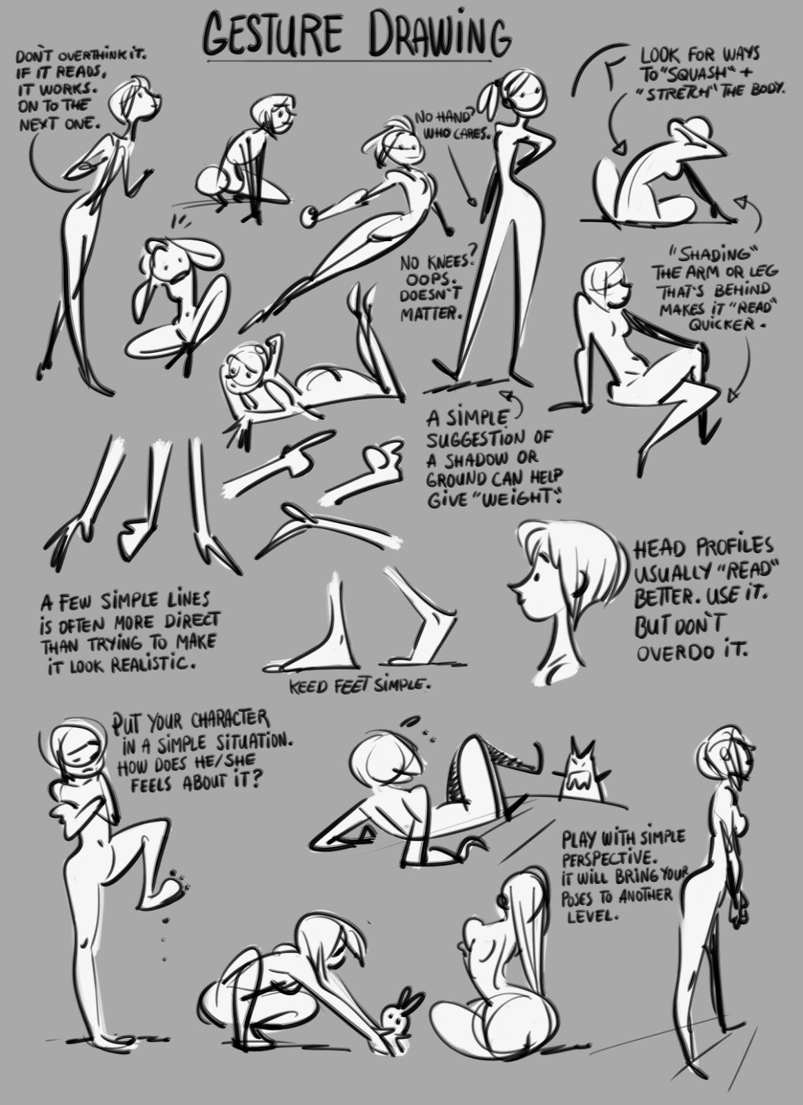
As part of my Teach Yourself series, I’ve been wanting to do a post about advice on gesture drawing. After having searched online for tips for a while now, I realize it is hard to locate any blogs that focus specifically on gesture drawing. As a result, I have decided to compile specific advice in the form of videos and handouts as I have been able to find them. These tips all come from different corners of the Internet, as opposed to a few specific blogs.

Defining 'gesture'

Gesture is about capturing the essence of what you’re drawing.

It is arguably the single most important part of making a lifelike figure. Without it, a drawing will seem stiff. When I decided I wanted to go for CalArts, I made it a goal to really hone in on my gesture skills. 

Gesture is about feeling the action and making mental observations before you ever put the pen down to the paper. This way, you’ll communicate clearly and guide the eye of the onlooker through an appealing flow of lines.

Advice

Here is a handout by Griz and Norm on gesture drawing:

(Source: grizandnorm)

When you’re drawing a gesture, the essence of the pose should be captured within a minute or so – perhaps even sooner. Instead of focusing your attention on each little part of the body, you should focus on getting the whole figure down, without too much detail. This way, you have everything you need, should you decide to finish the drawing at a later point in time.

(Source: drawingsfromamexican)


Rad Sechrist shares some very good advice on his blog, Rad How To, about gesture:


In one of these handouts, Sechrist points to the fact you need to ‘push’ the pose. This is something I think a lot about, too, as I draw. It can be very easy to fall into the trap of  “straightening up” a pose and making it more symmetrical. But when a drawing looses its angles and tilts, it also looses its power and life. If this is something you struggle with, you have to make a conscious effort to overcome this tendency by exaggerating the pose.

(Source: grizandnorm)


On a final note, I want to thank all these artists for sharing their advice on gesture drawing!  


-Christine-
  

16 May, 2016

TEACH YOURSELF | How To Do Solid Drawing

Solidity is the key to creating believable, three-dimensional characters out of your imagination.

I wanted to learn more about solidity during my studies at CalArts, so one of my teachers recommended I take a look at this video:


Seems simple enough! Solidity is just about imagining a 3D space, being conscious of overlap and avoiding twinning.

But in practice, I am finding this stuff doesn’t necessarily come easy if I don’t make a conscious effort – which is why I’ve been focusing so much on it. It’s not enough that I know about solidity – my drawings have to really show that I understand how to use it.

Glenn Vilppu’s Drawing Manual and Walt Stanchfield’s Drawn to Life are two books that have really helped in this regard. With these books, I am starting to better grasp how to easily visualize 3D space on a blank 2D piece of paper without reference. It truly is a basic skill needed in drawing from the imagination. Sometimes I get so frustrated with myself when I can’t draw what I intended in my mind! But maybe that's a good thing -- because it spurs me to want to become better.

As well as these books, I have also found a few online resources that I check back on regularly to better understand solidity and structure in drawing. As part of my Teach Yourself posts, I have shared these below. The idea behind this series is to use the internet to educate yourself about drawing.


(Source: radhowto)


Sechrist is a story-board artist at Dreamworks. His blog focuses a lot on teaching you to see the structure underneath what you’re drawing. On his blog, he has also shared some amazing video recordings from his online classes (radhowtoschool.com)


(Source: tobyshelton)

A story artist at Disney, Toby shares some advice on structure of, in particular, hands (as well as some awesome storyboards from various films!)


(Source: robutic)

Shinmoto has a post on his blog called “The Secret to Drawing” that is very inspirational. I have linked it above


(Source: willwestonstudio)


A good website for advice on structure, volume and anatomy


This PDF file is a transcript of one of Eric Larson’s lectures on Entertainment. In the notes, Larson goes over the principles that make up a good, solid drawing


Also, here are some youtube videos that explain the things that make up solidity, such as volume, foreshortening, overlap and perspective.


Then in this video, Ahmed Aldoori explains how you can draw cubes to help you draw poses from the imagination (similar to Vilppu's approach).


Finally, these are some notes from Glen Keane that I've hung up on my wall:


(Source: lindadornart)

If you find yourself struggling with solidity as well, I hope these links might be of some help to you!


-Christine-