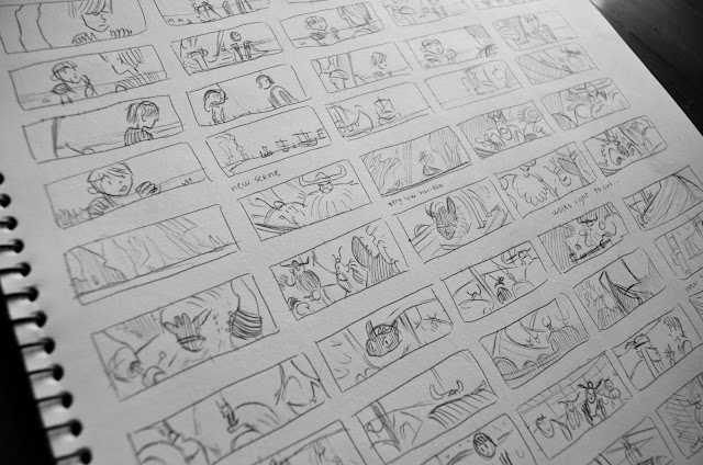
Recently, I made about 1800 thumbnail
studies from How to Train Your Dragon. Every
time there was a cut or a camera move, I would hit pause and draw the shot. I
got the idea to do so from a CalArts classmate, who in turn got the idea from a
post by Emma Coats. While I did the sketches, I paid close attention to the
composition of each frame. As Coats instructed in her post, I asked myself a
series of questions about the shots, such as, where are the characters positioned? Why was there a cut? How is the
frame divided? How are the angles and lines positioned in the shot? What do
they lead the eye to? Where is the camera positioned?
I did this exercise to study what makes up a
‘good’ composition. I had come to accept that to learn about composition from
movies, it is not enough to simply watch a lot of movies. In fact, when a
composition is well made in a movie, it is often difficult for the audience to
notice it – it flows into the storyline so well that that the audience gets
carried away into that world.
To many people, myself included,
composition can therefore be a bit of a mystery.
The first time I heard about composition was
in my Art History classes during high school. In these classes, we would
analyze paintings from around the world and how they reflected the thought
pattern of a given society during a specific time period. When we got to the
Renaissance and Venetian art, we learned that these artists used shapes, such
as converging lines and figural pyramids, to purposefully guide the eye through
the painting and convey the ‘mood’ of the time. We learned that Renaissance artists
used composition as a tool for creating visual depth and figurative meaning.
Still, I wasn’t sure what makes a ‘good’
composition. If composition is the arrangement of shapes within an image, then
at what point does it become a ‘bad’ combination?
To settle the ins and outs of composition,
I took a class at CalArts that covered composition. I found that composition is really just about making art that looks good to you while being mindful of the
purpose behind the composition.
In a nutshell, composition is about not settling before you’ve reached a point at which you’re happy with the ‘flow’ of the piece.
In a nutshell, composition is about not settling before you’ve reached a point at which you’re happy with the ‘flow’ of the piece.
That being said, there are a few basic
‘rules’ to keep in mind.
To reinforce and remind myself what I have
been taught, I have started analyzing movies on my own, like I did How to Train Your Dragon. On top of
that, I like to scout online to find any resonating insight. In this post, I’m
going to share some of the handouts and videos that have been helpful in
understanding how to lead the eye through a composition. Most of these sources agree that good composition is
about clarity, i.e. leading the eye to a point of interest, while being mindful
of what you’re trying to communicate story-wise.
Advice
Artist Rad Sechrist thinks about the relationships between shapes as he makes compositions. He has made a handout
on his site Rad How To that analyzes
a painting and how the artist guides the onlooker through it.
Another example of leading the eye is to point everything toward a single center of interest:
 |
| (Source: andreasdeja) |
Having the perspective lines converge where you want the audience to look is another way to guide the eye.
 |
| (Source: Marsha Russell) |
Yet more ways you can guide the eye
through a composition is by contrast. You can create contrast though lighting,
colors and/or patterns. Whichever element stands out the most (creates the
greatest level of contrast to the rest of the elements) in a given composition
will be where the eye looks. So for instance, if you have a composition with a
majority of circular shapes and then one triangular shape, the audience will be
attracted to the triangle.
 |
| (By Loui del Carmen, source: theartcenter) |
Here is a video by Ahmed Aldoori that analyzes some paintings by Paul Felix. Aldoori explains how Felix uses some of the principles I have mentioned above to create his compositions.
I hope these links and explanations help!
As always, thanks to all the artists who
shared this advice online!
-Christine-


